Transforming Workplace Strategy Through Data & Analytics
Timeline
2022 - 2025
Client
Atos
Ey
ISS + others
My Role
Product Designer
Tools
Figma
Power BI
Context
Where the product stood when I joined.
When I took ownership of the Analytics module in GemEx Platform - they had real potential, but the data was largely inaccessible. The existing dashboard showed raw sensor readings grouped by time stamps for basic occupancy status, with nothing to contextualise, compare or act on them. My very first task wasn’t to redesign them - it was to understand the data itself.
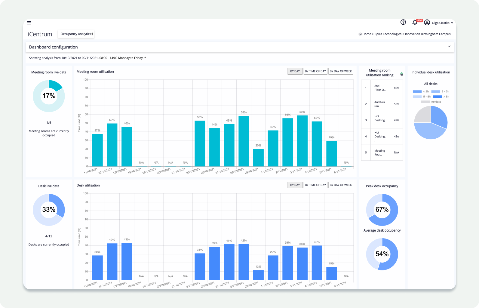
Old dashboard: including data for desks and meeting rooms mixed with live display
Discovery
Understanding the data before designing for it.
The platform's occupancy data came from PIR sensors installed beneath desks - primarily Yanzi and Disruptive Technologies hardware - which sent an occupancy status signal every minute. Before I could design anything meaningful on top of this data, I needed to trust it. So I manually cross-referenced raw sensor logs against the dashboard's occupancy output to verify they matched and spot possible issues and times when the device could be potentially down.
The same sensors also captured environmental data - temperature, humidity, CO₂, and noise levels. But at this stage, that climate data was mostly visible only on individual dedicated device pages, with no way to surface it across a floor or building. It was data the platform owned but couldn't yet use.
Once I had confidence in the sensor data, the next challenge was integrating a second, entirely different data stream: bookings from the GemEx app. These covered every bookable resource type across the estate.
Stream 1 - Hardware
Occupancy Data
Real-time presence detection from under-desk sensors. Verified manually against raw logs to establish data trust before surfacing in the UI.
Stream 2 - Software
Booking Data
Generated bookings across desks, meeting rooms, areas, parking spaces, showers, and lockers - a fundamentally different signal from physical presence.
Bringing these two streams together and deciding how to surface them, became one of the main design decisions of the project. In order to archive the correct outcome, I analysed our users to understand who and how will use dashboards, charts and Excel reports.
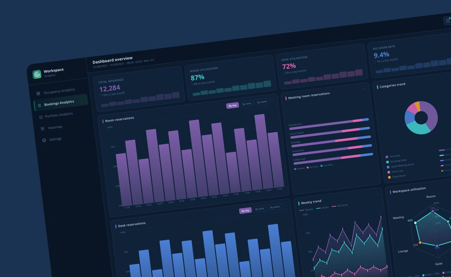
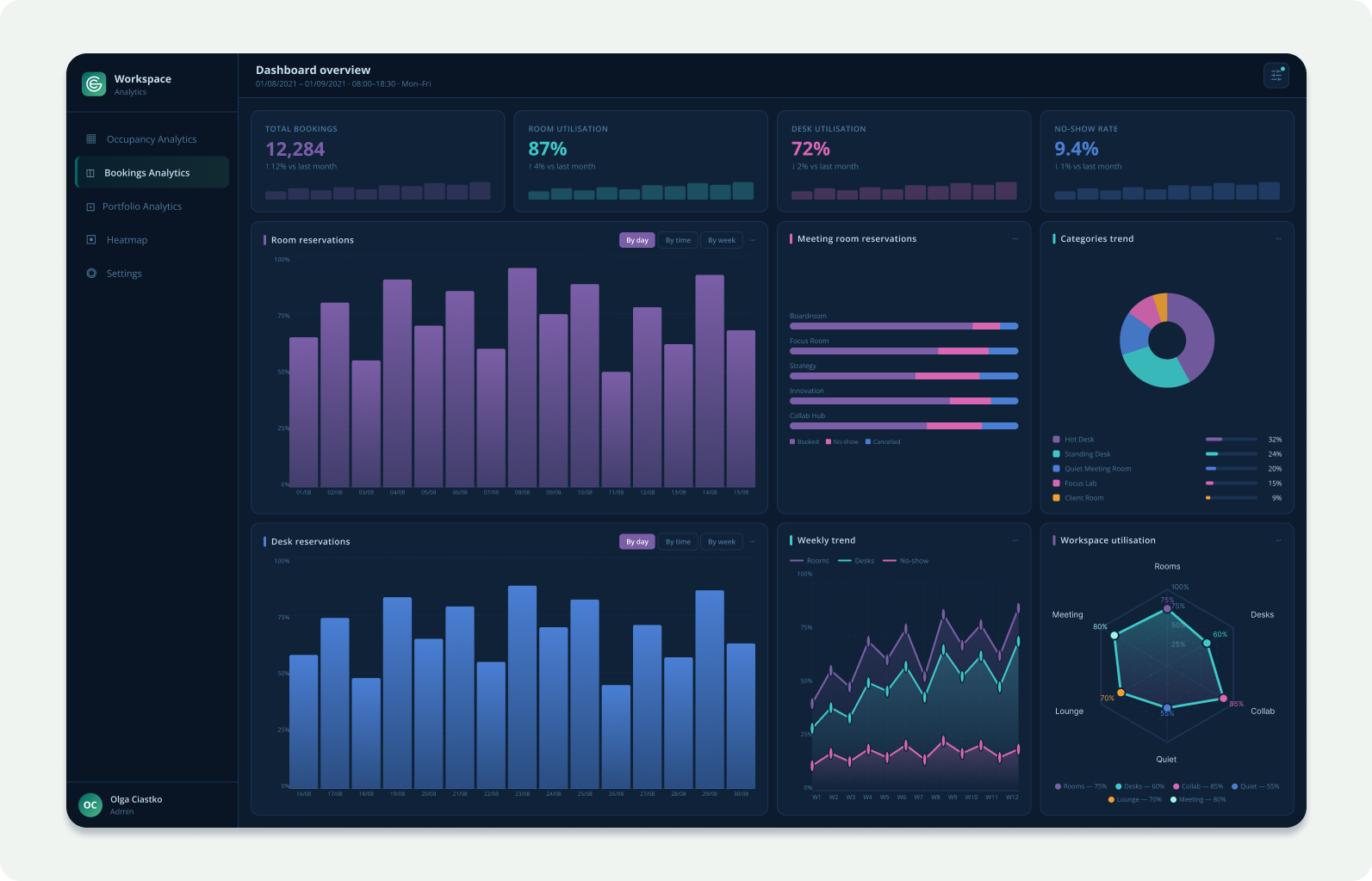
Image shows dashboard ideation for Booking Analytics for desk and meeting room reservations
How we decided to display Occupancy vs. Booking data:
I tested multiple display configurations with Facility Managers and Data Analysts: showing the streams merged, side-by-side, and layered - before converging on a direction.
Default: separate. Displaying occupancy and booking data independently as the default prevented users from confusing correlation with causation, a critical distinction when making real estate decisions.
User-controlled via filters. Users could toggle to view both streams together, or drill into a specific resource type - meeting rooms only, or a custom pairing like parking spaces + desks - depending on the question they were trying to answer.
Challenge
Four gaps preventing enterprise-scale use:
01
Granularity
Data was available at floor level only. Global clients like EY had no way to see building-wide or portfolio-wide performance, the view they needed to make strategy decisions.
03
Data Trust
Users perceived a gap between what sensors recorded and what the dashboard showed. Without transparency into the underlying data, analysts wouldn't stake a business case on it.
02
Actionability
Charts displayed raw data as static visuals. There was no path from a number on screen to a decision that could be taken because of it.
04
Tool Mismatch
Data Analysts were exporting to Power BI because our platform didn't speak their language. The product was losing power users to a competitor tool.
Strategy
My primary goal was to architect a new data hierarchy: one that served every persona without forcing anyone to use a tool designed for someone else. I introduced two entirely new tiers and refined the existing one.
NEW
Portfolio
Bird's Eye: EY Global Leadership
A portfolio-level view allowing EY's leadership to compare utilisation across countries. What previously took days of manual Excel consolidation now took seconds.
NEW
Building
Consolidated View: Atos Operations
A building-level overview giving Atos the ability to identify chronically underutilised sites. This became the evidence base that justified multiple site closures.
REFINED
Floor/Desk
Granular View: Facility Managers
Existing views rebuilt with descriptive analytics and ranking tables so FMs could act without needing to interpret raw bar charts themselves.
Designing for Personas
Facilities Manager vs Data Analyst - differentiating the experience
Persona A: Facility Manager
Primary focus: Daily workplace operations and employee experience
Main goal: Keep the building efficient, functional and cost-effective
Typical questions: Are spaces being used efficiently? Where are operational issues happening?
Time horizon: Immediate and short-term operational decisions
Preferred data: Real time occupancy, bookings, maintenance status, service requests
Dashboard priorities: Simplicity, quick and clear, operational actions
Key workflows: Managing spaces, resolving issues, optimising workplace operations
Success metrics: Space efficiency, reduced operational costs, workplace satisfaction
Pain points: Information overload, delayed issue detection, ghost bookings
Ideal dashboard: Easy to scan
Persona B: Data Analyst
Primary focus: Data interpretation, trends and strategic insights
Main goal: Turn workplace data into actionable business intelligence
Typical questions: What patterns are we emerging? What do the numbers suggest for future planning?
Time horizon: Medium and long-term strategic analysis
Preferred data: Raw data, historical records, forecasts, behavioural patterns, KPIs
Dashboard priorities: Filtering, segmentation, depth, comparative analysis
Key workflows: Building reports, analysing trends, validating hypotheses
Success metrics: Insights quality, reporting accuracy, forecasting reliability
Pain points: Poor data quality, Inconsistent data sources, limited drill down capabilities
Ideal dashboard: Customisable, data-rich, exports they can trust in Power Bi
Key Features
Drill down hierarchy
One platform, every zoom level - navigation from the Portfolio level → Building → Floor → Desk/Meeting Room → Sensor raw data. From overview to precise detail.
Resource Type Filter
Users could display occupancy and booking data separately or together, and filter by a single resource type or a custom pairing - e.g. desks + parking spaces only.
Occupancy bands
Configurable occupancy rules allow users to determine when a resource should be considered occupied. For example, requiring at least 15 minutes of occupancy helps eliminate false positives and random measurements.
Friction Analysis Chart
Visualised the gap between sensor data and booking data: exposing no-shows vs. ad-hoc use, the root cause of booking policy breakdowns.
Portfolio Comparison Engine
Side-by-side metrics for EY's regional leads to benchmark their efficiency against other global locations.
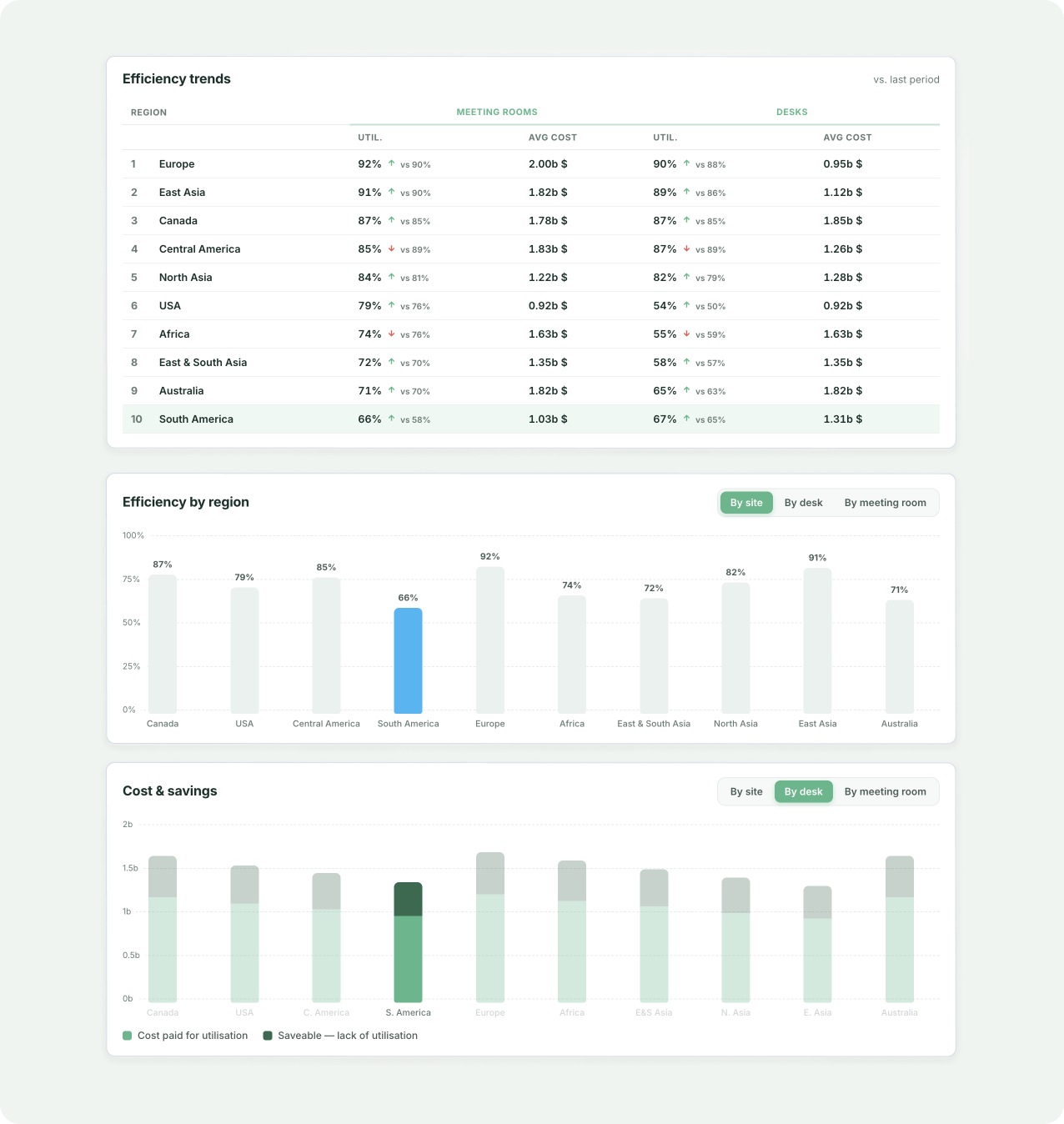
Image shows charts for portfolio level dashboards
Data in Action
The most meaningful validation came not from usability scores, but from watching clients act on the data the dashboards surfaced. These are real decisions made because of the design.
Desk shortage identified in EY Stockholm: 100 desks added
Peak occupancy data revealed desks were running at ~90% capacity daily, across the entire working week. The data gave the client the confidence to act: 100 additional desks were installed to meet the demand and relieve space pressure on the growing team.
Audit team identified as highest-intensity desk users
By filtering analytics by team, the Audit team emerged as the highest desk utilisation group in the organisation: reaching 76%+ on their busiest days. This insight prompted a conversation about dedicated workspace allocation for high-intensity teams.
42% of Calm rooms used without a booking
The most popular room type: Calm rooms, showed a 76% overall utilisation rate. But the breakdown told a more nuanced story: 41.9% were booked and used, while a near-equal 42% were occupied with no booking at all. This friction between real usage and booking policy triggered a client-led initiative to streamline how these rooms were managed.
Weekly trends: Tuesdays busiest, Mondays and Fridays quiet consistently
Over a three-month period, time-of-week filtering revealed a clear and consistent pattern: Tuesdays were the busiest day with 43% desk utilisation, while Mondays sat at 22% and Fridays at just 12%. This gave clients clear data to optimise scheduling, resource allocation, and cleaning rotas accordingly.
Scale
The volume this platform handled
To appreciate the design challenge, it's worth understanding the scale of data the platform was processing and visualising in real time.
1M+
bookings from a single client in one month (March 2026)
93%
of those bookings were for desks, 7.5% for meeting rooms
2.61M
bookings recorded across top 30 days alone
190k+
bookable data points handled
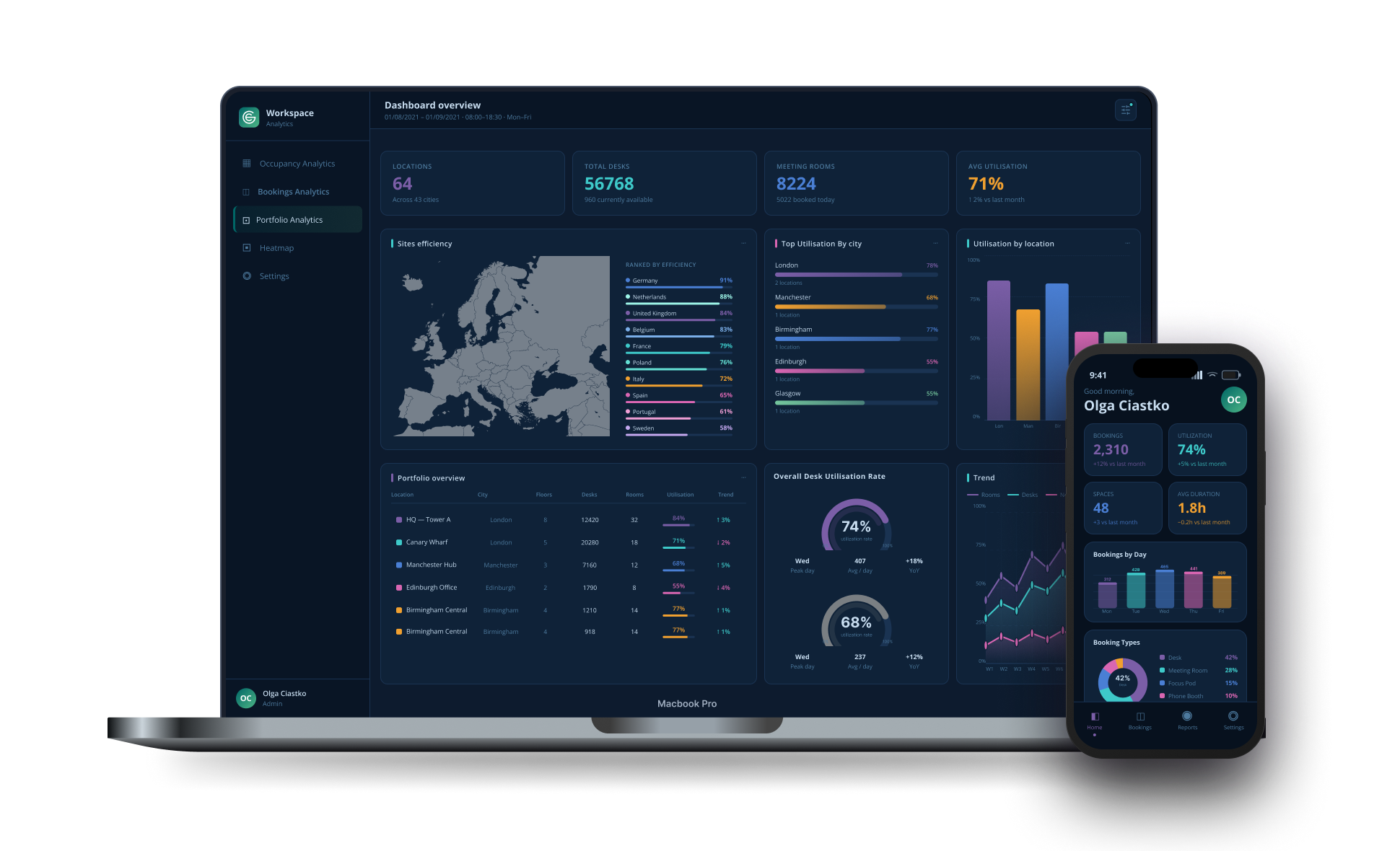
Image shows dashboard for portfolio level for web display and dashboard with analytics for mobile
Impact & Value
Real world results:
Atos
Building and portfolio level analytics gave Atos the evidence they needed to identify underutilisation across their estate. The Space Management dashboard surfaced critical occupancy insights that directly supported leadership's decision to close multiple sites - translating a design deliverable into a board-level financial decision.
EY
The Portfolio Comparison Engine allowed EY to standardise space reporting across dozens of countries. Regional leads could benchmark their efficiency against each other. What previously required days of manual Excel consolidation was reduced to seconds via the dashboard.
Data Trust
By rigorously validating sensor readings against dashboard outputs and building full raw data transparency into the drill-down, I achieved genuine Data Trust, reducing accuracy-related support tickets by over 40% and eliminating the need for analysts to cross-verify in external tools.
Learnings
01
Verify before visualise
Manually testing raw sensor data against dashboard output before designing on top of it set the foundation for everything. You can't design for trust without first earning it yourself.
03
Separate by default, merge by choice
The decision to display occupancy and booking data separately - tested with real users - prevented a subtle but critical design failure: users conflating two fundamentally different signals.
02
Know your user's other tools
Learning Power BI alongside analysts changed how I designed exports. Understanding their downstream workflow meant I could design for it, not around it.
04
Density and clarity aren't opposites
The most important challenge wasn't making it simple - it was making it simple enough for a FM to act in 30 seconds, and deep enough for an analyst to spend hours in. Both at once.