Where Smart Lockers Meet Smart Workplaces
Integrating the Vecos system into the GemEx to create a secure, connected, and effortless storage experience for EY employees.
Time range
November 2023 - September 2024
Team
Product Designer
Product Owner
2 Developers
Tools
Figma + FigJam
Lucid
Client
EY
Context
As hybrid working became the norm, enterprise employees stopped having a fixed desk and with it, a fixed place to store their belongings. Clients like EY, operating across tens of thousands of employees and thousands of physical lockers, needed a smarter solution. EY had already adopted the Vecos smart locker system at scale: 5,640 lockers across their New York headquarters alone, but employees were managing them through a separate app, entirely outside the GemEx ecosystem.
The goal was clear: bring locker management into the GemEx platform so employees could find, claim, unlock, and release lockers without switching context.
For clients like EY, where GemEx is deployed as a white-labelled workplace app, this meant the entire locker experience had to live natively within their environment: seamless, familiar, and trusted.
Challenge
The challenge wasn't simply adding a locker booking feature. It was designing a unified experience that bridged two separate cloud systems - GemEx and Vecos's Releezme platform - without exposing that complexity to the user.
The hardware configuration, locker setup, and admin management all remained on the Vecos side. GemEx handled the employee-facing experience and stored booking data. My design had to make that split-system architecture completely invisible — while handling everything it introduced.
Complexity
Complex asset states
Lockers are never just free or occupied. At any given moment, a locker might be assigned to a team, blocked by an admin, jammed, or offline. Each state required a clear, unambiguous treatment in the UI one that guided users toward the right action without surfacing technical detail they didn't need.
Split-system governance
Admins configured lockers in Releezme; employees interacted through GemEx. Any change on either side had to stay in sync. Designing across that boundary, ensuring what users saw always reflected reality - was a core constraint throughout.
Real-time physical interaction
Unlike room bookings, locker interactions are immediate and physical. Tapping "unlock" opens a door in seconds. That tight feedback loop demanded an interface with zero ambiguity - clear countdowns, unambiguous states, and no room for user error.
Goal
The goal was to give employees a single, trusted place to manage their locker, from before they arrive at the office to the moment they leave.
By integrating Vecos into GemEx natively, we removed the need for a separate app, reduced friction in the daily office experience, and gave organisations like EY the consistency of a fully unified workplace platform. Before a single screen was designed, I needed to fully understand how the Vecos system worked - its states, its rules, its failure modes - because earning user trust in a physical interaction starts with getting the logic exactly right.
Design process
The core challenge wasn't technical, but it was behavioural. Locker interactions are physical, immediate, and unforgiving. A confusing interface doesn't just frustrate a user; it leaves them standing in a corridor with their belongings and a locker they can't open. The experience had to be effortless under pressure.
01/ Research & Discovery
Before designing anything, I needed to understand Vecos from the inside out - how the hardware works, how Releezme manages locker states, and how admins configure the system. Working closely with developers and product owners, I mapped what was possible within the integration and surfaced the constraints that would shape every decision that followed.
02/ UX Flow
I mapped the key user journeys across both platforms -identifying where data crossed between Releezme and GemEx, and where the split-system model could break the experience. This was about designing around failure points before a single wireframe existed.
03/ Wireframes
Low-fidelity wireframes to pressure-test structure and navigation early - creating a shared, testable reference before any visual design investment was made.
04/ Validating Concepts
A focused prototype testing the core journeys: finding, claiming, unlocking, and releasing a locker. Validate the logic, surface the gaps, move forward with confidence.
05/ Iteration
Test findings fed directly back into the designs. I prioritised flows that created hesitation, refining until the experience felt natural, not learned.
06/ Final Designs
Every locker state - available, claimed, unlocking, blocked, was given clear, unambiguous visual treatment. Immediate, trustworthy, and physically intuitive.
07/ Delivery
Close collaboration with the development team throughout, backed by detailed documentation and user stories to ensure design intent survived the handoff.
Research & Discovery
Before designing anything, I needed to understand Vecos from the inside out: how the hardware is structured, how Releezme handles admin configuration, and how users interact with the system in a real office environment. Working closely with developers and product owners, I mapped what the integration could support and where the boundaries sat between the two platforms. These early explorations shaped the approach and surfaced the constraints that would drive every design decision that followed.
Three core user needs defined the direction:
Secure storage before arriving
Users needed to claim a locker in advance - knowing their space was ready before they walked through the door. Team lockers extended this further, giving groups shared, always-accessible storage for shared equipment or resources, without individual claiming required.
No new processes to learn
The experience had to fit naturally into the existing GemEx app flow - building on familiar patterns rather than introducing a new mental model users would need to adopt.
Fair, frictionless release
Users needed the ability to release a locker at any point. When they forgot, the system had to handle it automatically - protecting fair access for others while removing the anxiety of managing it manually.
Analysis
I mapped a high-level UX flow connecting Releezme, which manages hardware configuration, locker setup, and admin controls - with the GemEx ecosystem, covering both the employee mobile app and the Booking Administrator web platform.
A key early structural decision: should lockers live in a dedicated module, or be integrated into the existing Book module?
Mapping the full user journey made the answer clear. A separate Locker module gave clients with physical locker infrastructure a clean, standalone integration, without requiring the Book module at all. It also kept the architecture scalable for clients who might have lockers but no room booking in scope.
Wireframing
I always start with hand-drawn sketches - it's the fastest way to explore ideas before the design system becomes a constraint. Once the concept holds up, I move into Figma to refine, align with existing patterns, and build toward high fidelity.
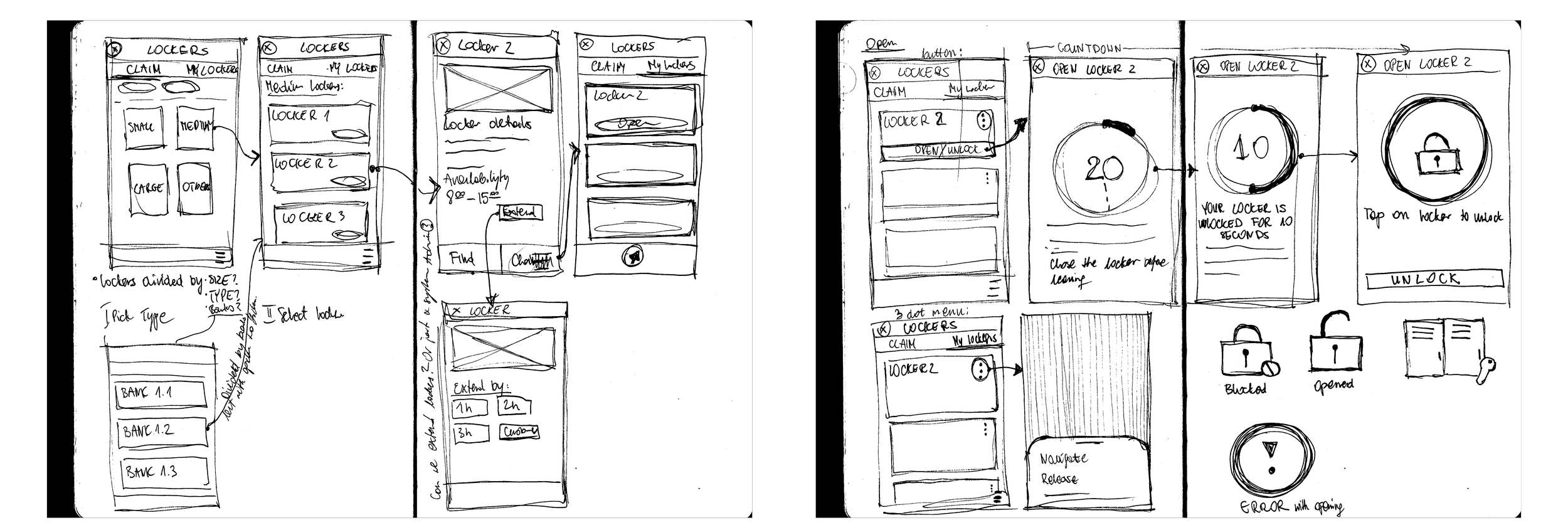
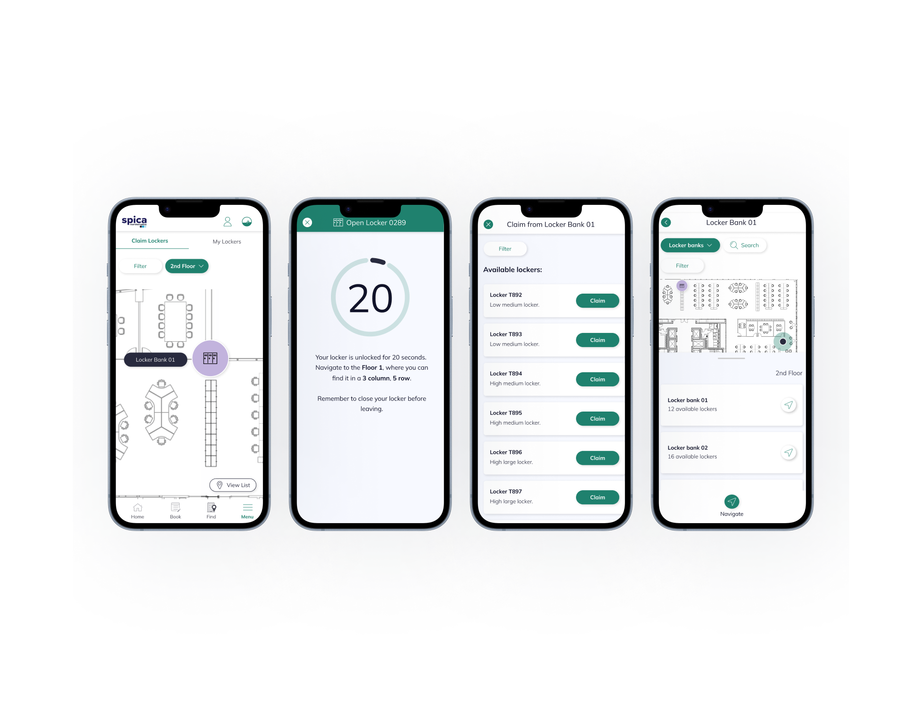
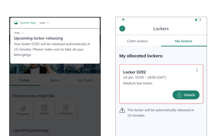
I created an intuitive screen that clearly guides users through the unlocking process - showing a 20-second countdown before the locker locks automatically, or sooner if the door is closed.
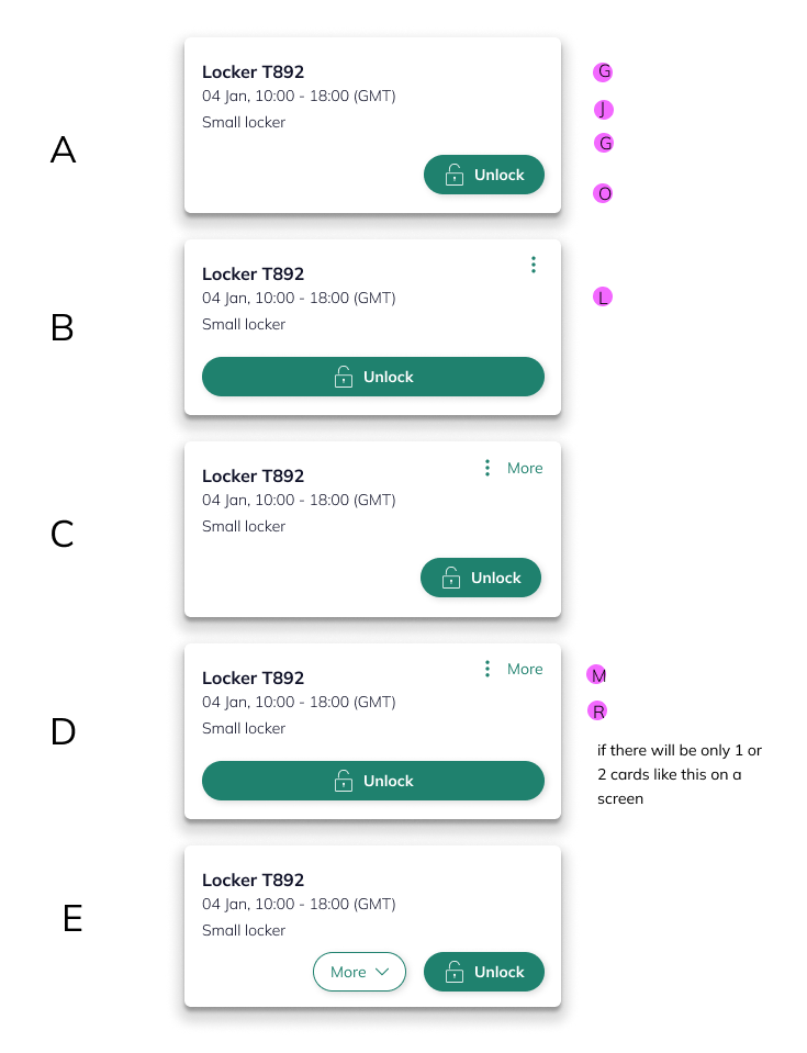
Reviewing card styles with the team and selecting the most usable option.
Contraints
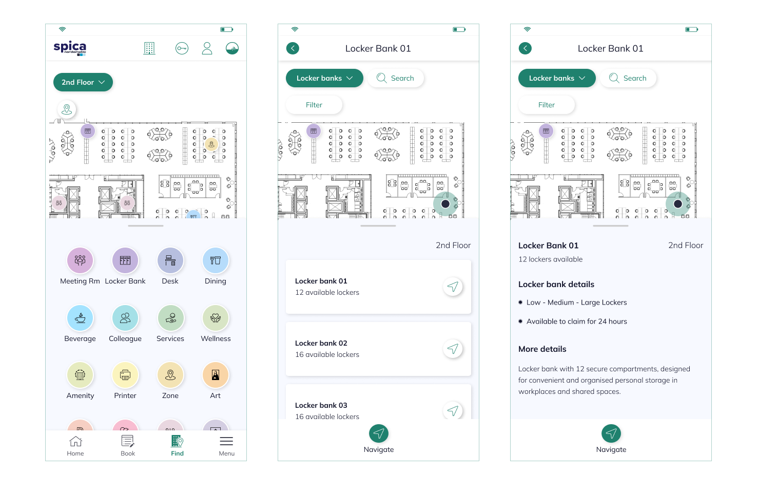
The map problem
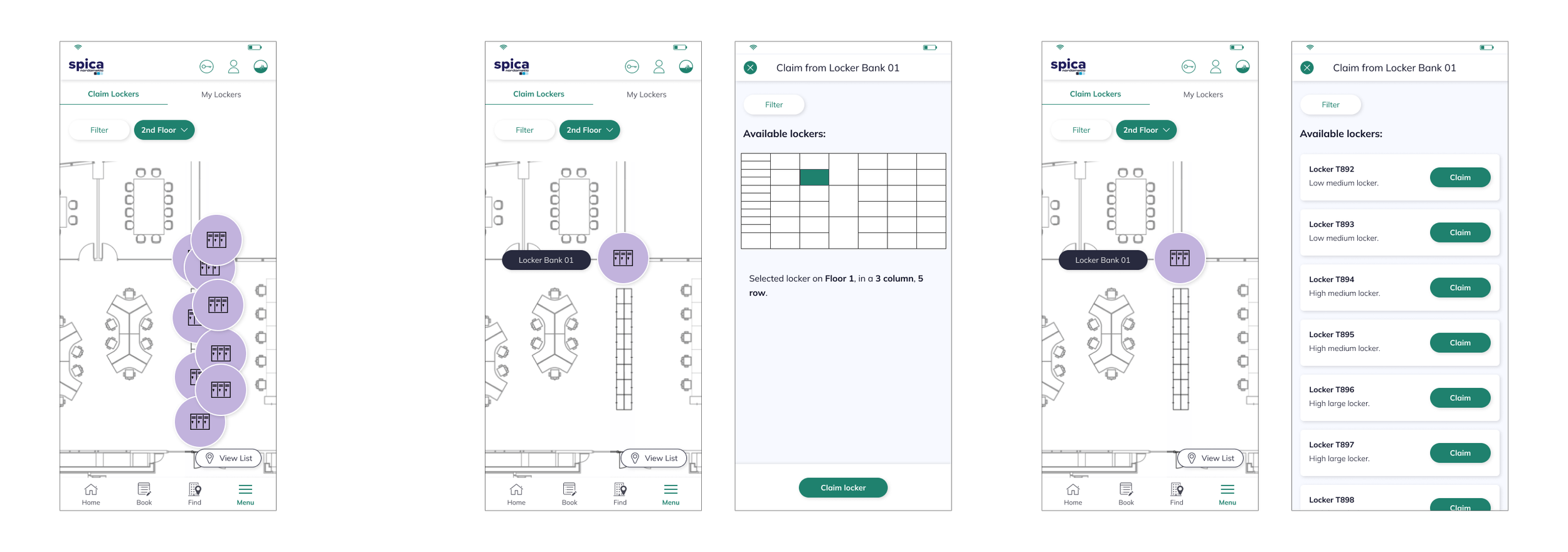
GemEx displays floor plans in 2D - which works well for desks and rooms. But lockers are stacked vertically. A column of ten lockers occupies a single point on the map, making individual selection impossible with our standard approach. With limited time, I proposed a new visual logic - drawing from familiar references, where row and column indicators guide users to the exact unit. It solved a genuinely novel spatial problem while staying within GemEx's existing interface language.
Validating concepts
Key findings
I explored several design directions, shared them with internal stakeholders, and ran usability testing with an interactive prototype. Watching people move through the flow - where they hesitated, where they went wrong, where things clicked - consistently revealed gaps that no internal review would have caught.
Confusing entry point
Almost every user navigated to the Book module first. The Locker module, tucked in the menu, wasn't where people instinctively looked - and the label "Claim" instead of the more familiar "Book" compounded the initial confusion.
Unclear locker status
Users were often uncertain whether a locker was physically locked, unlocked, or required manual closing after claiming. When the digital countdown and physical state didn't feel aligned, trust broke down - even when the system was working correctly.
Accessibility gaps
Users with mobility needs had no way to filter or request lockers suited to their physical requirements. This wasn't a nice-to-have - it was a compliance risk that needed to be addressed before launch.
Iteration
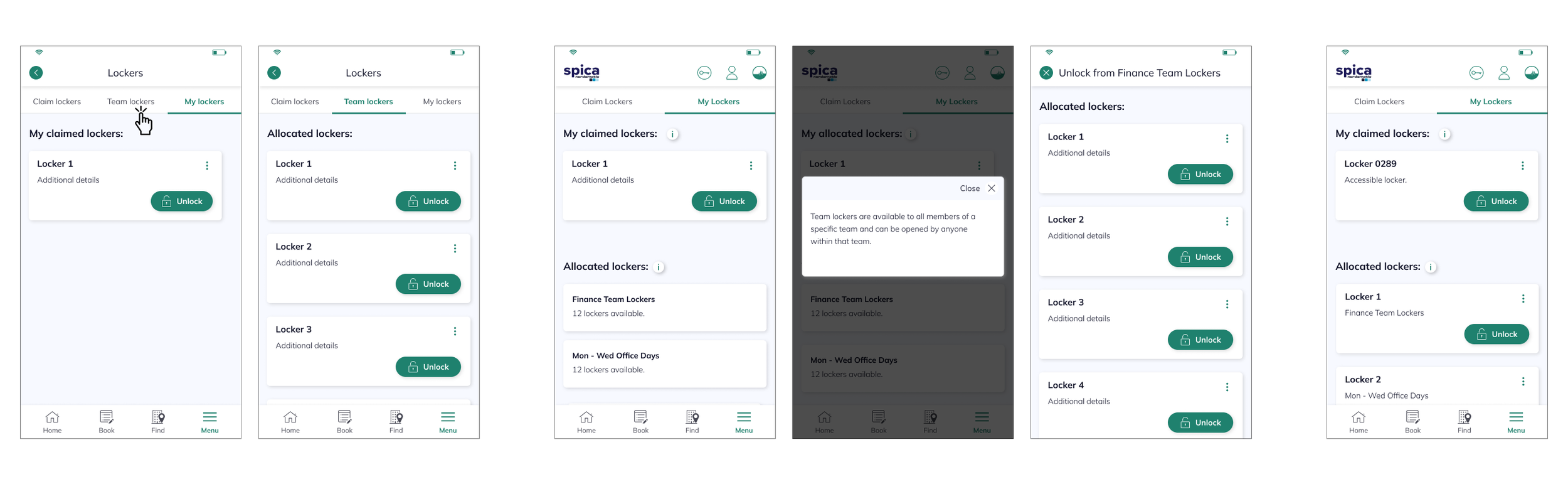
A significant focus at this stage was “Team Lockers” - shared storage accessible to any member of a defined group, such as the Finance Team, without individual claiming required. Admins needed clear controls to assign groups, add or remove users, and manage access - all from the GemEx platform. The design challenge was making team lockers immediately distinguishable from personally claimed lockers without adding cognitive load. I explored three approaches and, through developer input and user feedback, landed on a solution that was both technically viable and visually unambiguous in context.
I also designed the admin-side blocking capability - allowing Booking Administrators to lock down lockers at scheduled times, for example releasing all personal lockers at 6:00 PM when overnight storage isn't permitted. The logic had to work seamlessly in the background, with clear communication to users when a locker became unavailable.
Final designs
During this process, I presented all the findings from research and usability testing, and together we made decisions that defined the MVP for the project. One of the key decisions was to keep lockers in a separate Locker module, allowing clients with physical lockers to integrate them without requiring use of the Book module.
To help users navigate, I integrated locker banks into the existing Find module, designing a map view and details panel so users could easily locate their assigned lockers.
Usability testing revealed concerns about automatically released lockers and belongings left inside, so I designed a Past Lockers feature to ensure users could always find their items if needed. Finally, recurring questions from participants - such as, “What if I miss the locker release?” - led me to design clear pop-up notifications and in-module reminders, creating a system that supports users and reduces stress rather than adding friction to their day in the office.
I designed the final designs focused on creating a seamless and intuitive experience, defined by clear interactions and effortless navigation. Every element was thoughtfully refined to enhance engagement and make the locker claiming journey simple, satisfying, and enjoyable for users.
Business value
The core win: one ecosystem
Before this integration, EY employees managing lockers had to leave GemEx entirely and operate a separate app. Every context switch was a reminder that the platform wasn't complete. By bringing locker management natively into GemEx, we closed that gap: users could now find, claim, unlock, and release a locker without ever leaving the app they already relied on for their entire working day.
Stronger platform stickiness
Keeping users within the GemEx ecosystem isn't just a UX improvement, it's a product strategy signal. Each feature that replaces a separate tool deepens GemEx's position as the single workplace platform employees actually use, rather than one of several they tolerate.
Operational efficiency
Streamlined locker management reduced support overhead, eliminated manual processes, and gave Booking Administrators clear controls, all within the same platform they already used to manage the rest of the workplace.
Scalable foundation
The integration architecture was built to support multiple clients and configurations from the start, making it straightforward to roll out across new buildings, new organisations, and new locker setups without redesigning the experience from scratch.
Learnings
Technical constraints are a design brief
Integrating Vecos taught me that the most interesting design problems live at the boundary between systems. The 2D map constraint, the split-system architecture, the physical unlock window, each one was a constraint that became a more interesting solution than the standard approach would have produced.
Observation beats assumption
Watching users interact with the prototype revealed things no internal review would have caught - confusing terminology, invisible state changes, the anxiety around automatic release. Every session made the product sharper.
Small details build trust
Team Lockers, Past Lockers, countdown timers, timely notifications - none of these are headline features. But each one removed a specific source of friction or anxiety from someone's working day. That's what user-centred design actually looks like in practice.